Ambitious, direct-to-consumer (D2C) brands recognize the importance of email marketing — and why wouldn’t they? According to Statista, a leader in market and consumer data, it’s projected that there will be 4.3 billion email users by 2023. To put that into perspective, this population represents more than half of the world — an audience looking to learn, connect, and consume.
So, how does one get started constructing a successful email marketing campaign? Let’s start from the beginning and explore how to build your audience and create standout email content.
In this article:
Building Your Audience
Finding the Right People
Segmenting Your Audience
Constructing Your Email
Content
Deliverability and Policy Compliance
Building Your Audience
A number of years ago, I was promoting a book that I'd written with a friend of mine. One of our first campaigns leveraged an influencer and her massive Facebook following. This audience aligned perfectly with our demographic — the sheer number of followers guaranteed our success. Or did it?
Of the emails we sent, and the hundreds of thousands of impressions we generated, the influencer campaign failed to produce a single sale. I came to realize that I’d created a list of people that fit a certain description but failed to include an established relationship or those people who had some level of purchase intent.
How often have we been on the receiving end of emails that miss the mark? Our inbox is full of them — brands that haven’t earned a connection, emailing content we have little interest in.
When building an audience, thoughtful planning can deepen a relationship where hasty, ill-conceived communication can disrupt them. Considering this ahead of time goes a long way in capturing email addresses, maintaining engagement with readers, and delivering value. Here are some strategies we have come to utilize in our audience-building efforts to establish relationships and meet the needs of those we engage with.
Finding the Right People
Gain notoriety by actively contributing to online communities
Sometimes, establishing your expertise and generating interest requires that you surround yourself with the most passionate people in the space. Becoming active with online communities provides you the opportunity to contribute to discussions and produce informative articles.
Not only will you benefit from shares across large networks, but it’s also not uncommon for active members of these groups to be featured on blogs or podcasts — “gigs” that allow you to promote your website or email list. Regularly put together compelling content, and you’ll see your traffic increase and audience grow.
If you’re wondering which communities to get started with, Facebook, LinkedIn, and Slack offer excellent forums for like-minded individuals to share information and expand their professional networks.
Pop-ups
Okay, we’ll first qualify that pop-ups presented at the wrong time, or pop-ups that are obtrusive or too frequently used, can be annoying. Conversely, a well-timed, contextually driven pop-up can be a welcoming gateway to more information if a visitor to your site is looking for it.
Sumo, a third-party provider that works to increase site traffic for small businesses, conducted a review of nearly two billion pop-ups. They found that those with clarity, context, and value, substantially increased email subscriptions. The highest-performing pop-ups among those reviewed even saw a 40% conversion rate.
To establish clarity, context, and value with your pop-ups, we recommend a few best practices:
- Avoid triggering pop-ups immediately when your visitor arrives at the site.
- Consider using scroll percentage as a way gauge interest before presenting the invite.
- Create pop-ups that reflect the content on the page.
- Ensure that exit-intent pop-ups feature your most compelling offers — discounted subscriptions, free swag, and gated content test particularly well.
- Never hide the exit option. Allow people to click off the side of the pop-up to close.
Keep sign-up forms short and auto-fill where you can
Similar to our findings with pop-ups, keeping sign-up forms short, sweet, and contextual helps to streamline the process of joining an email list. It also helps to build trust and reciprocity as opposed to triggering fears of an unwanted sales call.
There are a few strategies that growing brands have begun to use to reduce the burden of email sign-up. Here’s a couple that we’re fond of:
- Consider using Google sign-in to capture important information about users.
- Utilize contact information enrichment through a service like Fullcontact, Peoplelooker, Clearbit, or Pipecandy.
Note that these services can be expensive, depending on the number of contacts you’re looking to enrich. However, depending on your business goals, the cost can be well worth the insights you obtain. These insights can also allow you to add greater personalization with the email campaigns you create, increasing the likelihood of success.
If it’s critical to your business to build a list using work emails, make sure to specify that requirement in your form.
Avoid buying email lists from third parties
Much like the example I shared above, leveraging audiences that you haven’t earned a connection with will result in poor performance. It’s much more effective to use these resources to build brand awareness or to drive traffic to your site.
Segmenting Your Audience
Once you have your audience, it’s essential to track what makes them unique.
The first areas that D2C brands typically focus on are demographics (age, gender identification, location) and firmographics (business size, number of employees, etc.). This information about your followers is made available through built-in reporting tools, depending on the social media platform you utilize.
Other popular segmentation strategies include:
- Evaluating your audience based on email engagement. This could mean creating segments based on a subscriber’s interaction with a specific message (target those who opened or clicked a campaign) or based on their interaction with your email categories (subscribers who purchased, for example, after-sales announcement emails vs. new season product newsletters).
- Categorizing users by the industries they operate in.
- Bucketing your audience based on where they are in their customer journey. Have they recently discovered your site? Are they active users of your services? Are they ambassadors of your brand?
- Determining the value that each customer brings to your business (high-value customers may warrant a different message than low-value customers).
For more on segmenting your customers:
Constructing Your Email
From an email marketing perspective, email content is the area that marketers think most about. For the hours that we spend pouring over flowery language and fancy designs, it’s the area that we most often get wrong.
As you think about building your email, you should rely heavily on the audience you have decided to message, what they represent, and what they’re looking for. From here, it’s easy. Well, not exactly — but you’ve already taken an important step that, according to Hubspot, 42% of marketers leave out when planning their email marketing strategy.
Once you have a sense of who you’ll be communicating with, you can create something with relevance and impact. In this section, we outline the most critical elements of an email. This will allow you to create a professional design that reinforces your brand while increasing the likelihood your audience consumes the message and takes action.
Rich text (HTML) vs. plain text
Rich text (or HTML) is another way of referring to emails with all the bells and whistles — image-heavy, highly formatted messages that recreate the look and feel of your website.
Plain text, on the other hand, comprises the simplest of messages — basic, text-only communication that prioritizes deliverability and emulates the type of email you might receive from a friend.
So, when building an email campaign, which is better to use? It’s got to be the visually oriented, well-structured variety of emails, right? Well, it’s not quite that simple. In a study by Marketo, plain text emails regularly outperform the open rate of rich text emails by more than 10%. Other studies have indicated that the difference in open rates can be even more substantial than that.
But why would the content of your email impact whether or not it’s opened? Well, it doesn’t — not directly, anyway. Spam filters love plain text emails. By the sheer nature of how email works, sending a plain text email can increase the chances it’ll be delivered and, therefore, opened.
So what's the verdict, you ask? Should you use plain text or rich text to build your email campaigns? The answer again comes down to your audience. Rich text communicates professionalism — a key factor in why marketers are 20% more likely to choose rich text over plain text. Plain text conveys simplicity and familiarity — an element that can help the writer connect with the reader.
We’re among the population of marketers that use both. Leveraging both rich text and plain text is another way to customize your email campaign to fit your objectives and address the uniqueness of your audience. We suggest that you consider each of these when planning out your strategies.
Structuring a rich text (HTML) email
Optimize for mobile
Audiences are experiencing email via mobile more than ever before. In fact, according to Emailmonday, nearly 50% of emails are read using a mobile device. Building your emails with a mobile-first mentality will improve the customer experience and keep them coming back.
We’d note that in our tests, “mobile-friendly” template designs aren’t always as friendly as the designers would lead you to believe. Before deploying your email campaign, check out the email on your mobile device to ensure that there aren’t any strange artifacts or awkward alignments.
Headers
As you’re building your template, we suggest that you incorporate a header image. This can take the form of a banner, or even just your company’s logo. Using a header image helps your rich text email feel more official. If you choose to go the banner route, your header can even help set reader expectations or summarize your message.
Margins
Margins are important, especially for emails read on the desktop. When building or selecting a template, we recommend margins that make up between 20%-30% of your vertical space, split between the left and right sides of the browser.
We also recommend that these margins are a different background color than what you select for the body of your email. This will help focus the attention of readers on the content you worked so hard to put together. Like many marketers out there, we use a light grey background for our margins.
Padding and line breaks
Padding and line breaks are additional tools we use to focus the reader's attention and allow your message to breathe.
A recent Microsoft study found that marketers have less than eight seconds to leave an impression. Using visual aids in the form of padding and line breaks can take a wall of text and make it easier to scan and consume — getting you closer to that eight-second window that you need to engage your audience in.
Content
Now, on to the heart of your email. ❤️ To help this guide become an active resource for building your email marketing strategies, we wanted to share some dos and don’ts for each piece of the email you work on.
Subject line
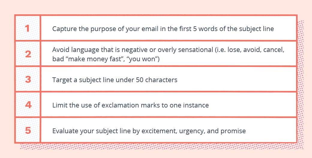
The subject line is one of the most important parts of an email. In fact, according to a 2019 study by Convince & Convert, 33% of email recipients open an email based on the subject line alone. This illustrates the importance of taking your time to craft a subject line that's both relevant and engaging.
Here are a few priorities you should consider when setting up your subject line:
![]()
Personalization
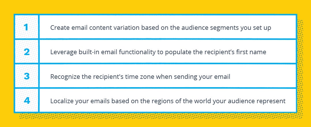
Speaking as directly to your audience as possible will help build that coveted relationship. But how do you go about personalizing emails at scale?
First off, you're never going to be exact in this effort. Tailoring your message to reflect individuality while at the same time sending thousands of messages is always going to be an imperfect effort. That said, there are considerations to be made to avoid the one-size-fits-all approach and create the illusion of personalization. Here are a few things that we recommend:
![]()
Email copy
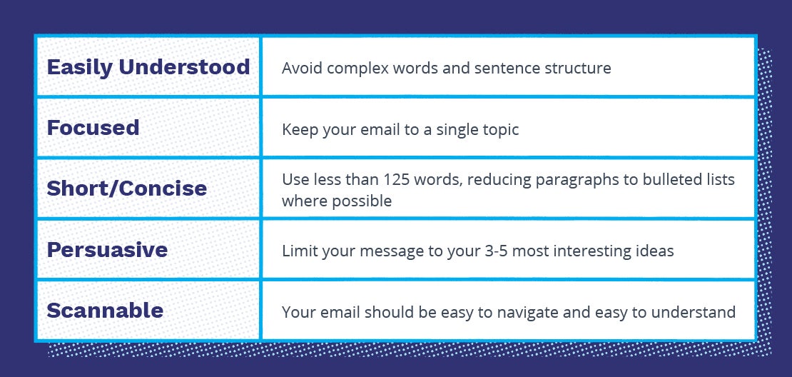
The email copy should be short, concise, and personalized. To achieve this, we recommend the following:
![]()
The call to action (CTA)
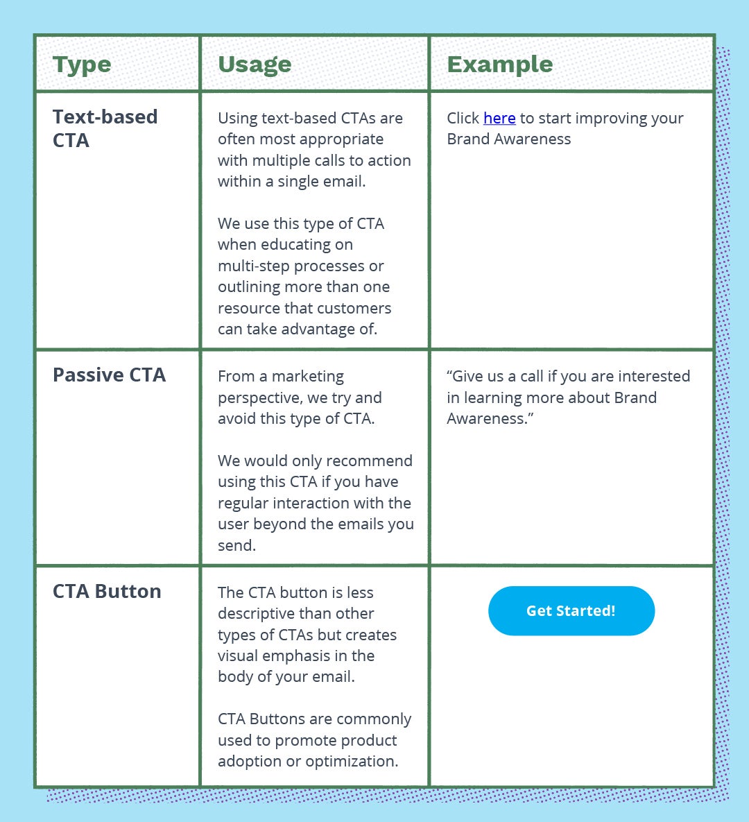
The CTA is typically tied to the purpose of the email. What is it that you would like the reader to do — visit a landing page, adopt a product, update their contact information? There’s a lot to think about when building a CTA. The table below should help you identify which type of CTA is best suited for your campaign.
![]()
Preparing your images
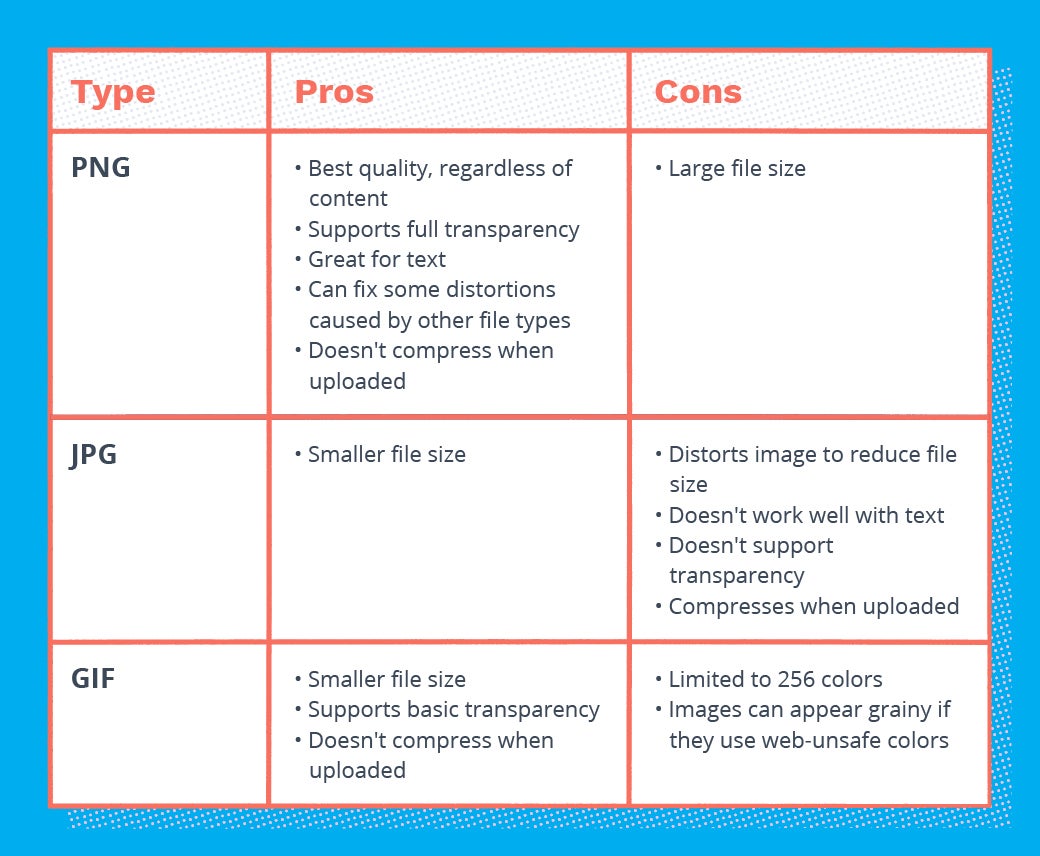
Everyone loves images, right? Images go a long way to add personality to your emails, explain complex ideas, and increase the rate of consumption. When using images, however, you’ll want to balance things like file size and image quality. This will help your emails load quickly and maintain engagement with the reader.
The table below compares commonly used image files and the benefits that come along with using them.
![]()
Image dimensions/resolution
Along the lines of image file types, dimensions and resolution play a critical role in how your email looks and loads. For most images, you should target less than 600 pixels on the longest side and around 480 pixels on the shortest side.
![]()
For large-format images, make sure that they take up no more than 30% of the email. Our tests have shown an increased likelihood that using such large images can negatively impact deliverability.
Video
While video is a great way to engage your audience in various places across the web, including a video in the body of your email can be a tricky proposition. In fact, most email clients we tested failed to support embedded video at all.
![]()
Given the relatively limited support for embedded video, we recommend using a clickable image that redirects to your website or the platform your video is hosted on.
Here’s an example of how you might set up this image:
![]()
As an alternative to linking to where the video is hosted, you might also consider an animated GIF.
Animated GIFs, in case you’re unfamiliar, are a series of compressed images strung together to create an animation or video clip.
Similar to our recommendation around large format images, animated GIFs should be used sparingly — paying close attention to the size of the file and length of the animation. Failure to do so can result in truncated emails or deliverability issues.
There are a number of free animated GIF generators if you already have the video ready to go. One of our favorites is EZGIF.
Deliverability and Policy Compliance
Avoiding spam filters
It’s checklist time! Here are some of the most effective ways to prevent your email from ending up in the spam folder.
- Audit your email lists every few months. Remove individuals that fail to engage with your content. This will signal to email service providers (ESP) that your emails are valuable to their customers.
- Avoid excessive use of symbols or punctuation in your subject lines. Too many exclamation or question marks can send your message straight to spam.
- Stay away from ALL CAPS. Doing so tells ESPs that the email may meet professional standards.
- Maintain a high level of email engagement. High open and click-rates suggest that the emails you’re sending are relevant to the audience. Strive for a greater than 30% open rate and an 8% click rate.
- Avoid sending from your personal inbox, instead, send your emails through a reputable provider. These providers take precautions to authenticate your emails and increase the likelihood of delivery.
- Consider signing your emails with your name as opposed to an organization. While not always possible, this checkbox tells the ESP that a person was behind the message and not a spam bot.
- Include the address of your business at the bottom of the email. Providing your physical location can create legitimacy with spam filters that are scanning your message for harmful or unwanted information.
- Add an unsubscribe link to your message. Not only is an unsubscribe link required for marketing emails in many parts of the world, the option tells the spam filter that "there’s a way out” if the email content fails to interest their customers.
Don't miss out on part two of this blog post, which goes over campaign launches and how to maximize performance.
[amp-cta id="6968"]
Last updated on September 20th, 2023.

